How To Build A Gradient Changing Website

I am a final year student at the University of Benin, currently studying Chemical Engineering.
I started learning how to code 5 months ago and I'm currently in a bootcamp to improve my skills.
I love MUSIC 😁, tv series and movies. Oh and I'm a big time foodie 😏.
Gradient-changing websites are a popular design trend that allows users to navigate through different background color gradients using the next and previous buttons. These websites can add a dynamic and visually interesting element to a web page, and they are relatively easy to build using HTML, CSS, and JavaScript.
In this article, I will show you how to create a gradient-changing website that allows users to navigate through different color gradients by clicking on the next and previous buttons.
This website will also have additional features namely:
A loading page that is displayed before the main page
An add more gradients button that triggers a modal and allows users to choose two colors and a color name for the gradient
A viewing CSS button that allows users to view and copy the CSS code for each gradient displayed at the time.
A view all gradients button that allows users to view all gradients in the form of cards.
I will be provide step-by-step instructions and code examples to help you build your own gradient-changing website.
HTML
The first step in building the website is to create the HTML structure for the loading page. This should include a container element for the logo and the loader.
This should include a container element for the background color and buttons for navigating through the gradients.
Here is an example of the HTML code for the loading page of the website:
<section id="loader">
    <div>
        <h1>GradientGrids</h1>
        <img src="images/loader.gif" alt="Logo" />
    </div>
</section>
This code creates a div element with an id of "loader" that will be used as the container for the logo and the loading spinner image. Before moving to the next step, comment out the code for the loading page.
The next step is to build the HTML of the main page the loading page. This should include a header element containing all the relevant features and information about the gradient e.g the color code; and the main element for displaying the background color, color name, and buttons for navigating through the gradients.
Here is an example of the HTML code for the main page of the website:
<header>
    <div class="top">
        <h1>GradientGrids</h1>
    </div>
    <div class="bottom">
        <button id="menuBtn">
            <i class="fa-solid fa-bars"></i>
            View all gradients
        </button>

        <p id="gradientText">
            <span id="previewColor1"></span>
            <span id="gradientColor1">#780206</span>
            <i class="fa-solid fa-arrow-right"></i>
            <span id="gradientColor2">#061161</span>
            <span id="previewColor2"></span>
        </p>

        <div class="btns">
            <button id="addToGradientBtn">
                <i class="fa-solid fa-circle-plus"></i>
            </button>
            <button id="viewCssBtn">
                <i class="fa-solid fa-code"></i>
            </button>
        </div>
    </div>
</header>
<main>
    <!--   Add More Gradients Modal -->
    <div id="addToGradientBg" class="modal-bg">
        <div id="addToGradient" class="modal">
            <form id="saveGradient">
            <p>Pick 2 colors to add new gradient</p>

            <div id="colorInput">
                <input id="color1" type="color" value="#780206" />
                <input id="color2" type="color" value="#061161" />
            </div>

            <label for='gradientName'>Gradient Name:</label>
            <input id='gradientName' type='text' placeholder='Create a gradient name'/>
            <button>Save Gradient</button>
            </form>
        </div>
    </div>

    <!--   View CSS Modal -->
    <div id="viewCssBg" class="modal-bg">
        <div id="viewCss" class="modal">
            <p>Copy Css Code</p>

            <code id="cssCode">
                background: #780206; /* fallback for old browsers */
                <br />
                background: -webkit-linear-gradient(to right, #780206, #061161); /* Chrome 10-25, Safari 5.1-6 */
                <br />
                background: linear-gradient(to right, #780206, #061161); /* W3C, IE 10+/ Edge, Firefox 16+, Chrome 26+, Opera 12+, Safari 7+ */
                <br />
            </code>

            <button id="copyCssBtn">Click To Copy</button>
        </div>
    </div>

    <!--   View All Gradients Overlay -->
    <div id="overlay"></div>

    <!--   Main Page-->
    <p id="colorName">Shady Day</p>
    <div class="container">
        <button id="prevBtn">
            <i class="fa-solid fa-chevron-left"></i> Prev
        </button>

        <button id="nextBtn">
            Next <i class="fa-solid fa-chevron-right"></i>
        </button>
    </div>
</main>
This code creates a header element that will be used as the container for the logo, the colour code of the gradients and the view more gradients, add more gradients and view css buttons. It also contains a main element that contains the code for the view more gradients and add more gradients modal, the view css overlay and the main section that displays the background color, color name, and buttons for navigating through the gradients
CSS
The next step is to style the website using CSS. This should include styles for the container element and the buttons, as well as any other elements you want to include on the page.
Here is the CSS code for styling the loading page of the website:
/* =============
    Loader Screen
=================*/
#loader {
    height: 100vh;
    display: flex;
    align-items: center;
    justify-content: center;
    text-align: center;
}

#loader img {
    max-width: 40%;
    display: block;
    margin: 0 auto;
}
This code sets the height of the loading page to be 100vh so that it fills the entire screen. It also sets the displayof the loader to be flex to centralise the logo and spinner on the page.
The spinner img 's display and margin properties are set to centralise the image on the page. The output is shown below:

Here is the CSS code for styling the main page of the website:
/* =============
    General
=================*/

* {
    box-sizing: border-box;
}

html,
body {
    margin: 0;
    padding: 0;
    overflow: hidden;
}

body,
button {
    font-size: 1rem;
    font-family: 'Clash Display', sans-serif;
}

button {
    background: #f0efefb6;
    border: none;
    padding: 1em;
    cursor: pointer;
    color: #313131;
    transition: 500ms;
    font-weight: 500;
}

button:hover,
button:active {
    color: #f0efef;
    background: #313131;
}

body {
    color: #313131;
}

main {
    position: relative;
    background: linear-gradient(to right, #780206, #061161);
    min-height: calc(100vh - 127px);
}

h1 {
    font-family: 'Telma', cursive;
    color: #ba904f;
    background-image: -webkit-linear-gradient(0deg, #ba904f 0%, #cb1eb7 100%);
    background-clip: text;
    -webkit-background-clip: text;
    text-fill-color: transparent;
    -webkit-text-fill-color: transparent;
    margin: 0;
    font-size: 2.5rem;
    font-weight: 700;
    text-align: center;
}

/* =============
    Header
=================*/
header h1 {
    font-size: 2rem;
}

header .top,
header .bottom {
    padding: 1em 0;
}

header .bottom {
    display: flex;
    flex-wrap: wrap;
    justify-content: center;
    align-items: center;
    z-index: 3;
    box-shadow: 0 1px 4px rgb(0 0 0 / 22%);
}

header .btns {
    font-size: 0;
}

#menuBtn i {
    margin-right: 1em;
}

#addToGradientBtn {
    border-right: 1px solid #313131;
}

#viewCssBtn {
    border-left: 1px solid #313131;
}

#gradientText {
    margin: 0;
    font-weight: 500;
    text-transform: uppercase;
    letter-spacing: 1.5px;
}

#previewColor1,
#previewColor2 {
    padding: 0.25em 0.8em;
    border: 1px solid #313131;
}

#gradientText i {
    margin: 0 0.6em;
}

#previewColor1 {
    background: #780206;
}

#previewColor2 {
    background: #061161;
}

#gradientColor1 {
    margin-left: 0.5em;
}

#gradientColor2 {
    margin-right: 0.5em;
}

@media screen and (min-width: 768px) {
    header .bottom {
        justify-content: space-between;
        padding: 0em;
    }

    header .btns,
    #menuBtn {
        display: block;
    }

    #gradientText {
        margin-right: 6em;
    }
}

@media screen and (max-width: 767px) {
    header .bottom {
        flex-direction: column;
        align-items: stretch;
        justify-content: center;
        padding: 0;
    }

    header #addToGradientBtn,
    header #viewCssBtn {
        width: 50%;
    }

    header #gradientText {
        padding: 1em 0;
        text-align: center;
    }
}

/* =============
    Main
=================*/
main .container {
    min-height: calc(100vh - 300px);
    display: flex;
    justify-content: space-between;
    align-items: center;
}

#colorName {
    margin: 0;
    padding: 1em 0;
    text-align: center;
    color: #f0efef;
    font-size: 1.5rem;
    font-weight: 600;
    text-shadow: 0px 0px 0px 100px #000;
}


/* =============
    Modal
=================*/
.modal {
    background-color: #fff;
    position: absolute;
    top: 45%;
    left: 50%;
    transform: translateX(-50%) translateY(-45%);
    width: 50%;
    height: 300px;
    border-radius: 10px;
    padding: 1.5em;
    z-index: 100;
    box-shadow: 0px 10px 15px -3px rgba(0, 0, 0, 0.1);
}

.modal-bg,
#overlay {
    display: none;
    position: absolute;
    width: 100%;
    height: 100%;
    top: 0;
    left: 0;
    right: 0;
    bottom: 0;
    background-color: rgba(0, 0, 0, 0.5);
}

#overlay {
    display: none;
    flex-wrap: wrap;
    justify-content: space-between;
    align-items: center;
    background-color: #fff;
    overflow-y: scroll;
    padding: 2em;
    z-index: 100;
}

#overlay div {
    width: 90%;
    height: 200px;
    border-radius: 15px;
    color: white;
    margin: 1em 0;
    display: flex;
    justify-content: center;
    align-items: center;
    text-align: center;
}

@media screen and (max-width: 767px) {
    #overlay {
        justify-content: center;
    }

    .modal {
        width: 90%;
    }
}

@media screen and (min-width: 768px) {
    #overlay div {
        width: 48%;
    }
}

@media screen and (min-width: 992px) {
    .modal {
        width: 40%;
    }

    #overlay {
        display: none;
        flex-wrap: wrap;
        justify-content: space-between;
        align-items: center;
        background-color: #fff;
        overflow-y: scroll;
        padding: 2em;
    }

    #overlay div {
        width: 32%;
    }
}

/* =======================
    addToGradient Modal
======================= */
#addToGradient {
    display: flex;
    flex-direction: column;
    align-items: center;
    justify-content: space-between;
    display: none;
}

#addToGradient p,
#viewCss p {
    color: #000;
    text-align: center;
    margin: 0;
    font-size: 1.2rem;
    font-weight: 500;
}

#colorInput {
    display: flex;
    justify-content: space-between;
    align-items: center;
    height: 90px;
    width: 200px;
    margin: 0 auto;
}

#colorInput input {
    cursor: pointer;
    width: 50px;
    height: 40px;
}

label {
    display: block;
    margin: 0 auto;
    text-align: center;
    margin-bottom: 0.5em;
}

#gradientName {
    display: block;
    margin: 0 auto;
    padding: 0.5em;
    margin-bottom: 1.2em;
    border: 1px solid #000;
    border-radius: 5px;
    font-family: 'Clash Display';
}

#saveGradient button,
#copyCssBtn {
    padding: 0.8em;
    border-radius: 10px;
    background: #000;
    color: #f0efef;
    display: block;
    margin: 0 auto;
    margin-top: 0em;
}

#saveGradient button:hover,
#saveGradient button:active,
#copyCssBtn:hover,
copyCssBtn:active {
    color: #f0efef;
    background: #061161;
}

@media screen and (min-width: 654px) {
    #saveGradientBtn {
        margin-top: 1em;
    }
}

/* =======================
    viewCss Modal
======================= */
#viewCss {
    display: none;
    width: 70%;
}

#cssCode {
    background: #f0efefb6;
    display: block;
    white-space: nowrap;
    padding: 1em;
    overflow-x: scroll;
    margin-top: 1em;
}

#copyCssBtn {
    margin-top: 1em;
}

@media screen and (min-width: 992px) {
    #viewCss {
        width: 50%;
    }
}

@media screen and (max-width: 767px) {
    #viewCss {
        width: 90%;
    }
}
The code for the buttons sets the display to be flex so that the buttons are separated and centered on the page, and sets the margin, padding, border, font-size, and cursor to give the buttons a consistent look and feel. The code for the respective modals and overlays are also shown above.
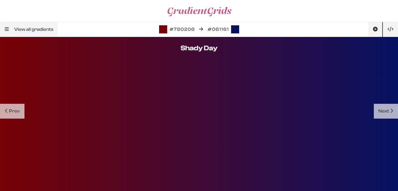
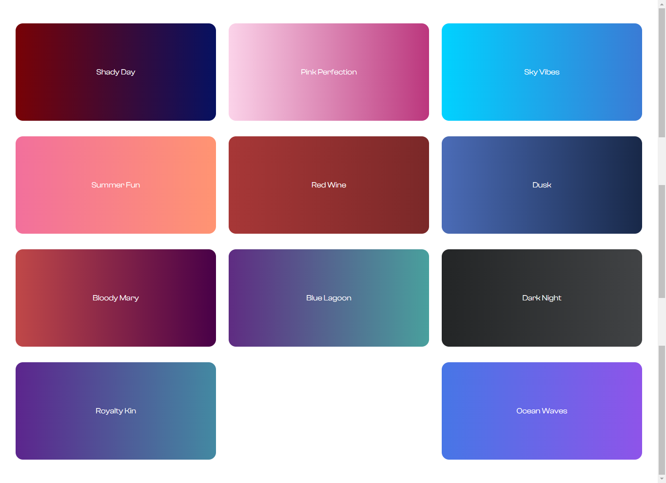
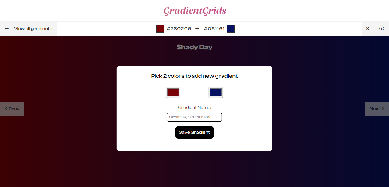
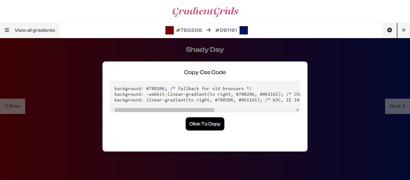
The expected output for each is shown below:
- Main Page Of Gradient Grids
- View All Gradients Overlay
- Add More Gradients Modal
View CSS Modal
JavaScript
The final step is to add the JavaScript code for handling button clicks and changing the background color. This should include an array of color values, a variable for tracking the current gradient, and event listeners for the next and previous buttons as well as the code for adding functionality to features
Here is the JavaScript code for a gradient-changing website:
//Loading Screen
document.querySelector('body').innerHTML = `
       <section id="loader">
          <div class="container">
              <h1>GradientGrids</h1>
              <img src="images/loader.gif" alt="Logo" />
          </div>
      </section>
  `;

//Functions
//Basic Functionality
const startFunctionality = () => {
    document.querySelector('body').innerHTML = `
      <header>
            <div class="top">
                <h1>GradientGrids</h1>
            </div>
            <div class="bottom">
                <button id="menuBtn">
                    <i class="fa-solid fa-bars"></i>
                    View all gradients
                </button>

                <p id="gradientText">
                    <span id="previewColor1"></span>
                    <span id="gradientColor1">#780206</span>
                    <i class="fa-solid fa-arrow-right"></i>
                    <span id="gradientColor2">#061161</span>
                    <span id="previewColor2"></span>
                </p>

                <div class="btns">
                    <button id="addToGradientBtn">
                        <i class="fa-solid fa-circle-plus"></i>
                    </button>
                    <button id="viewCssBtn">
                        <i class="fa-solid fa-code"></i>
                    </button>
                </div>
            </div>
        </header>
        <main>
            <div id="addToGradientBg" class="modal-bg">
                <div id="addToGradient" class="modal">
                    <form id="saveGradient">
                        <p>Pick 2 colors to add new gradient</p>

                        <div id="colorInput">
                            <input id="color1" type="color" value="#780206" />
                            <input id="color2" type="color" value="#061161" />
                        </div>

                        <label for='gradientName'>Gradient Name:</label>
                        <input id='gradientName' type='text' placeholder='Create a gradient name'/>
                        <button>Save Gradient</button>
                    </form>
                </div>
            </div>

            <div id="viewCssBg" class="modal-bg">
                <div id="viewCss" class="modal">
                    <p>Copy Css Code</p>

                    <code id="cssCode">
                        background: #780206; /* fallback for old browsers */
                        <br />
                        background: -webkit-linear-gradient(to right, #780206,
                        #061161); /* Chrome 10-25, Safari 5.1-6 */ <br />
                        background: linear-gradient(to right, #780206, #061161);
                        /* W3C, IE 10+/ Edge, Firefox 16+, Chrome 26+, Opera
                        12+, Safari 7+ */ <br />
                    </code>

                    <button id="copyCssBtn">Click To Copy</button>
                </div>
            </div>

            <div id="overlay">

            </div>
            <p id="colorName">Shady Day</p>
            <div class="container">
                <button id="prevBtn">
                    <i class="fa-solid fa-chevron-left"></i> Prev
                </button>

                <button id="nextBtn">
                    Next <i class="fa-solid fa-chevron-right"></i>
                </button>
            </div>
        </main>

  `;

let counter = 0;
const arrayOfGradients = [
    ['#780206', '#061161', 'Shady Day'],
    ['#FBD3E9', '#BB377D', 'Pink Perfection'],
    ['#00d2ff', '#3a7bd5', 'Sky Vibes'],
    ['#f2709c', '#ff9472', 'Summer Fun'],
    ['#a73737', '#7a2828', 'Red Wine'],
    ['#4b6cb7', '#182848', 'Dusk'],
    ['#C04848', '#480048', 'Bloody Mary'],
    ['#5f2c82', '#49a09d', 'Blue Lagoon'],
    ['#232526', '#414345', 'Dark Night'],
    ['#5C258D', '#4389A2', 'Royalty Kin'],
    ['#4776E6', '#8E54E9', 'Ocean Waves'],
];

 // General Dom Elements
    const main = document.querySelector('main');
    const addToGradientBg = document.getElementById('addToGradientBg');
    const addToGradient = document.getElementById('addToGradient');
    const viewCssBg = document.getElementById('viewCssBg');
    const viewCss = document.getElementById('viewCss');
    const cssCode = document.getElementById('cssCode');
    const overlay = document.getElementById('overlay');
    const saveGradient = document.getElementById('saveGradient');

    //Dom Buttons
    const prevBtn = document.getElementById('prevBtn');
    const nextBtn = document.getElementById('nextBtn');
    const addToGradientBtn = document.getElementById('addToGradientBtn');
    const viewCssBtn = document.getElementById('viewCssBtn');
    const copyCssBtn = document.getElementById('copyCssBtn');
    const menuBtn = document.getElementById('menuBtn');

    //Color Based Elements
    const colorName = document.getElementById('colorName');
    const gradientColor1 = document.getElementById('gradientColor1');
    const gradientColor2 = document.getElementById('gradientColor2');
    const color1 = document.getElementById('color1');
    const color2 = document.getElementById('color2');
    const previewColor1 = document.getElementById('previewColor1');
    const previewColor2 = document.getElementById('previewColor2');
    const gradientName = document.getElementById('gradientName');

    //Functions
    // View All Gradients Functionality
    const viewAllGradients = () => {
        arrayOfGradients.map((card) => {
            overlay.innerHTML += `
    <div style='background:linear-gradient(to right, ${card[0]}, ${card[1]})'>
      <p>${card[2]}</p>
    </div>
  `;
        });
    };

    viewAllGradients();

    // copy Css Functionality
    const copyCssCode = (col1, col2) => {
        cssCode.innerText = `
          background: ${col1}; /* fallback for old browsers*/
          background: -webkit-linear-gradient(to right, ${col1}, ${col2}); /* Chrome 10-25, Safari 5.1-6 */
          background: linear-gradient(to right, ${col1}, ${col2}); /* W3C, IE 10+/ Edge, Firefox 16+, Chrome 26+, Opera 12+, Safari 7+ */;`;

        document.querySelector('#cssCode br').style.display = 'none';
    };
    // Change Gradient Functionality
    const changeGradient = () => {
        colorName.textContent = `
          ${arrayOfGradients[counter][2]}
      `;

        main.style.background = `linear-gradient(to right, ${arrayOfGradients[counter][0]}, ${arrayOfGradients[counter][1]})`;
        previewColor1.style.background = `${arrayOfGradients[counter][0]}`;
        previewColor2.style.background = `${arrayOfGradients[counter][1]}`;
        gradientColor1.textContent = `${arrayOfGradients[counter][0]}`;
        gradientColor2.textContent = `${arrayOfGradients[counter][1]}`;

        copyCssCode(arrayOfGradients[counter][0], arrayOfGradients[counter][1]);
    };

    //Event Listeners
    // Next Button
    nextBtn.addEventListener('click', () => {
        if (counter === arrayOfGradients.length - 1) {
            counter = 0;
        } else {
            counter++;
        }

        changeGradient();
    });

    //Prev Button
    prevBtn.addEventListener('click', () => {
        if (counter === 0) {
            counter = arrayOfGradients.length - 1;
        } else {
            counter--;
        }

        changeGradient();
    });

    // Add To Gradient Modal
    addToGradientBtn.addEventListener('click', () => {
        if (
            addToGradient.style.display === 'block' &&
            addToGradientBg.style.display === 'block'
        ) {
            addToGradient.style.display = 'none';
            addToGradientBg.style.display = 'none';

            addToGradientBtn.innerHTML = `
        <i class="fa-solid fa-circle-plus"></i>
    `;
        } else {
            addToGradient.style.display = 'block';
            addToGradientBg.style.display = 'block';

            addToGradientBtn.innerHTML = `
        <i class="fa-solid fa-xmark"></i>
    `;
        }
    });

    // Save Gradient Form
    saveGradient.addEventListener('submit', (e) => {
        e.preventDefault();
        arrayOfGradients.push([
            `${color1.value}`,
            `${color2.value}`,
            `${gradientName.value}`,
        ]);
        counter = arrayOfGradients.length - 1;

        changeGradient();

        addToGradient.style.display = 'none';
        addToGradientBg.style.display = 'none';

        addToGradientBtn.innerHTML = `
        <i class="fa-solid fa-circle-plus"></i>
    `;
        overlay.innerHTML = '';
        viewAllGradients();
    });

    //view Css Modal
    viewCssBtn.addEventListener('click', () => {
        if (
            viewCss.style.display === 'block' &&
            viewCssBg.style.display === 'block'
        ) {
            viewCss.style.display = 'none';
            viewCssBg.style.display = 'none';

            viewCssBtn.innerHTML = `
        <i class="fa-solid fa-code"></i>
    `;
        } else {
            viewCss.style.display = 'block';
            viewCssBg.style.display = 'block';

            viewCssBtn.innerHTML = `
        <i class="fa-solid fa-xmark"></i>
    `;
        }
    });

    //Copy Css Btn
    copyCssBtn.addEventListener('click', () => {
        navigator.clipboard.writeText(cssCode.innerText);

        cssCode.innerHTML = '<p>Succesfully Copied!</p>';

        setTimeout(() => {
            copyCssCode(gradientColor1.textContent, gradientColor2.textContent);
        }, 1000);
    });

    // View All Gradients Overlay
    menuBtn.addEventListener('click', () => {
        if (overlay.style.display === 'flex') {
            overlay.style.display = 'none';

            menuBtn.innerHTML = `
         <i class="fa-solid fa-bars"></i>
         View all gradients
    `;
        } else {
            overlay.style.display = 'flex';

            menuBtn.innerHTML = `
        <i class="fa-solid fa-xmark"></i>
        View all gradients
    `;
        }
    });
};

//Main Screen
setTimeout(startFunctionality, 1500);
The final output of this code can be found in this link. If you need more info about this project, you can visit the Github Repo here.
